
Perhaps the most important lesson I've ever learned in the stock market came via John Murphy.
John has written many books, but it was his work on intermarket relationships that really inspired me. I now know the importance of "beneath the surface" signals. I have several "go to" sustainability ratios that I use to evaluate the market's strength or weakness. One of those ratios is the price of copper ($COPPER) vs. the price of gold ($GOLD). Copper prices reflect global demand vs. supply and can provide us a glimpse into global economic activity. Gold, on the other hand, tends to rise and fall more on the levels of fear and volatility. Below is a quick snapshot of this $COPPER:$GOLD ratio over the past 10 years on a weekly basis:
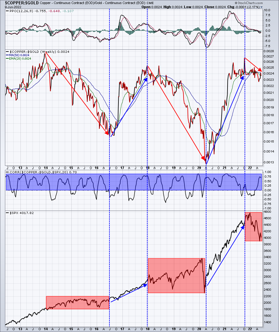
Note that the blue-shaded area is mostly above zero. This is the correlation coefficient and positive readings let us know that there is mostly positive correlation between the direction of copper vs. gold AND the benchmark S&P 500, which makes pretty good sense. The blue directional lines in the ratio coincide with strong S&P 500 periods, while the red directional lines coincide with the red-shaded areas. These red-shaded areas are extremely choppy and sometimes just downright bearish. As we look at this ratio currently, it's downtrending along with the S&P 500. We need to see both reverse, but we definitely should remain skeptical of U.S. equities as long as this COPPER:GOLD ratio is downtrending.
 |
Happy Trading!Tom BowleyChief Market StrategistEarningsBeats.comBetter Timing. Better Trades. |