

Correlation Coefficient is a GREAT Tool to Prove (or Disprove) a Thesis
One of the tools at StockCharts.com that isn't discussed often enough is the correlation coefficient.
You can access it by looking under "Indicators" and finding "Correlation" on the drop down menu. This indicator allows you to compare how closely any two symbols are correlated - either positively (above 0 with highest level +1) or negatively (below 0 with lowest level -1).
One of my favorite "sustainability ratios" is consumer discretionary vs. consumer staples stocks (XLY:XLP). Consumer spending represents roughly 2/3 of GDP, so it makes perfect sense to me to see whether the more aggressive discretionary stocks are outperforming. If they are, that should be a very bullish signal for the benchmark S&P 500. Or is there even a positive correlation between the two? Let's take a look:
Enter S&P 500 ($SPX):
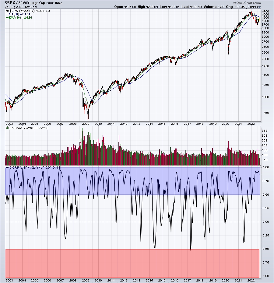
The correlation panel at the bottom outlines strong positive correlation (+0.5 to +1.0) in a blue-shaded area, while strong negative correlation (-0.5 to -1.0) is in a red-shaded area. Note that the S&P 500 and XLY:XLP ratio tends to move with positive correlation, meaning that they are very positively correlated. Look at the number of times this correlation is greater than +0.5. This correlation nearly lives in this blue-shaded area. On the flip side, the red-shaded area has only seen correlation hit -0.5 one time, in 2017. This is NOT a perfect signal, but it's a pretty darn strong one..
 |
Happy Trading!Tom BowleyChief Market StrategistEarningsBeats.comBetter Timing. Better Trades. |