
EB Daily Market Report - State of the Market, Part 1 - Wednesday, June 21, 2023
Current Market Update
Similar to Tuesday, we've seen much of today's market damage inflicted during the first half of the trading session, though we do still have a couple more hours of trading. Things could clearly change. We've also seen what I expected last week - money rotating out of growth (QQQ, -1.25%) and into more value-oriented areas like the Dow Jones ($INDU, -0.15%). Small caps ($SML, -0.02%) and mid caps ($MID, -0.29%) are also performing well on a relative basis.
Leadership today is coming from energy (XLE, +1.31%) as crude oil prices ($WTIC, +1.78%) rally to $72.50 per barrel. There's notable weakness in the hot aggressive sectors as technology (XLK, -1.18%), consumer discretionary (XLY, -1.04%), and communication services (XLC, -1.03%) trail the field and are the only sectors losing more than 1%.
Below is the first part of a two-part series, State of the Market. Today's Part 1 will focus on the S&P 500 Big Picture, some short-term historical tendencies, commodities, and international markets/ETFs. Part 2 (tomorrow) will be a more in-depth look at the U.S. equity and bond markets.
Personally, I've used some of the recent weakness to re-establish positions in areas that I like. I believe industrials (XLI) are a much better reward-to-risk option than the more aggressive stocks in technology (XLK), so I own the XLI. I like both the airlines ($DJUSAR) and railroads ($DJUSRR) as I'm looking for a run higher in transports ($TRAN). I own the Russell 2000 (IWM) and am adding the TNA (3x leveraged ETF that tracks the Russell 2000) as small caps pullback. My final entry will be a 20-day EMA test on the IWM, should we get there.
I like the QQQ and SPY as well, but feel there's still a bit more short-term risk in these right now.
State of the Market - Part 1
It was just over one year ago that I made a very bold and convicted market bottom call. While I love to use technical analysis to help me manage risk in my trading strategies, I've found that most, if not all, traditional technical analysis tools lag when it comes to predicting tops and bottoms. Successfully making those tough calls requires a hefty dose of perspective, along with many non-traditional means of evaluating market health. I don't believe ANY two market bottoms or tops are exactly the same. Therefore, it requires the willingness to adapt to every market environment. Too many market analysts try to pigeon-hole market tops and bottoms into looking just like others, which I believe is a very big mistake. As an example, I recall the rapidly-declining dollar being blamed in 2006 and 2007 as a major reason for the 2007-2009 bear market. But if you look back to the 2000-2002 bear market, the dollar was screaming higher, but there was no mention of that. Instead, it was as if analysts at the time had long-term memory issues or simply decided to analyze using recency bias.
I believe it's imperative to do our own independent, proprietary, and unbiased research to help us make those difficult top and bottom calls. Getting the overall market direction correct is important, because we like to use different strategies in bull market advances vs. bear market declines. I've been labeled a permabull, but those who have followed me for a long period of time know that I will turn bearish, when necessary.
Big Picture 100-Year S&P 500 Chart
I always start with this Big Picture chart of the S&P 500 for PERSPECTIVE:
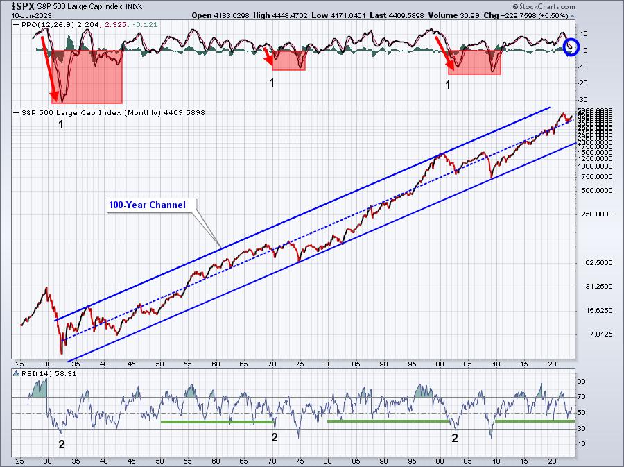
Look at the chart above and let me ask a very simple question. Do you think it's smarter to be bullish most of the time or bearish most of the time? If you answer "bearish", then you'll need to explain why, because it's very clear to me that the stock market rises a whole lot more often than it drops. In fact, the S&P 500 has risen 54 of the last 72 calendar years. That tells us that there's a 3 to 1 likelihood that the stock market will go up vs. down in any given calendar year.
The next thing I want you to focus on is the black 1s and 2s that I've put on the chart. These numbers represent the 1-2 punch that bears inflict technically during the first leg down of a SECULAR (long-term) BEAR market. In each of the last 3 secular bear markets, the monthly PPO cascaded lower, going through its centerline like a hot knife through butter. The monthly RSI moved down to 30 or below. But during SECULAR BULL markets, the monthly PPO nearly always remains above its zero line and the monthly RSI remains above 40. What has just happened? The monthly PPO is "hooking up" just above centerline support and monthly RSI turned up beautifully off of 40 support. These signals DO NOT support the theory that the 2022 CYCLICAL (short-term) bear market will evolve into a SECULAR bear market. But they totally support all of the bottom signals that I saw in 2022.
I absolutely remain 100% bullish the Big Picture. I can't say that we're going to see the market continue to melt up like we've seen recently, but everything, in my opinion, points to the Big Picture heading higher.
Historical Tendencies
While I rarely trade based solely on historical tendencies, I always try to remain aware of market history, because we often see it repeat itself. I can also combine it with what I'm seeing technically to improve my odds of shorter-term trading success, similar to what you might use the PPO/MACD for. It's one signal, that's all, so please don't blow it out of proportion. I do know, however, that history tells me that the worst period for U.S. stocks since 1950 has been from the July 17th close through September 27th close. The few weeks just prior to July 17th, though, tends to be bullish as are all pre-earnings periods, which I define as the 3 weeks leading up to the start of earnings season. Should we see a pre-earnings advance in early July, it makes sense to watch for any short-term cautious signals, because of this historical tendency to see market weakness over the late summer.
While Q3 tends to be our weakest quarter, Q4 is our strongest and is typically led by industrials and financials.
Commodities: Gold, Silver, and Copper
Gold ($GOLD):
Let's start with gold ($GOLD). Many look to inflation and the U.S. dollar when analyzing the prospects for gold. While I don't necessarily disagree with that approach as there's plenty of evidence that suggests we do exactly that, I believe that THE MOST important factor to consider when evaluating gold is VOLATILITY ($VIX). As I look at gold's relative performance to the S&P 500 over many, many years, I find the best correlation is the direct positive correlation with the VIX. It's my belief that FEAR is a much bigger determinant of whether to own gold or not. Here is the positive correlation between the $GOLD:$SPX ratio and the direction of the VIX:
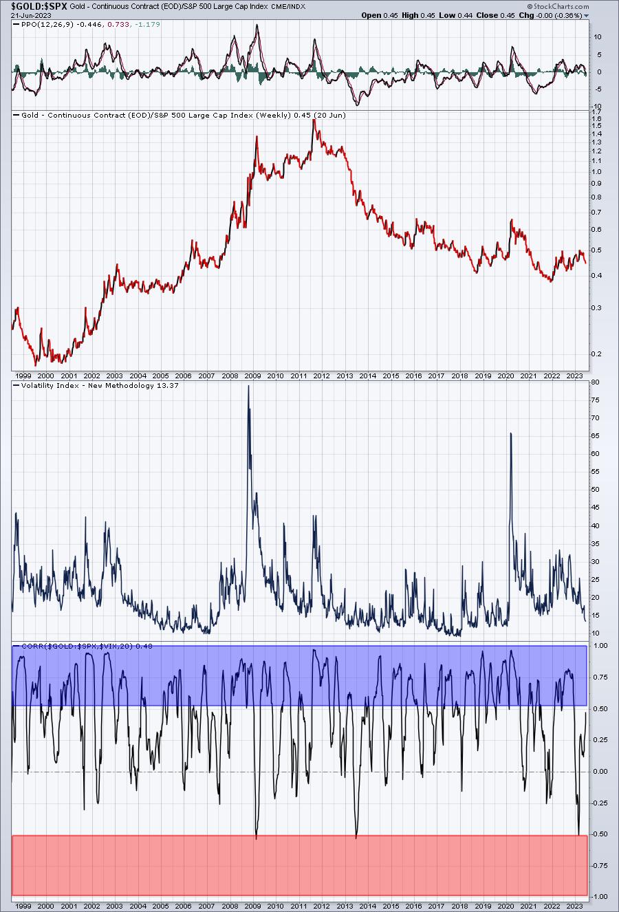
I believe the correlation coefficient at StockCharts.com proves my point rather emphatically. This is why I'm not a fan of $GOLD right now. I see the S&P 500 continuing to rally into year end and into 2024 and the VIX declining further, eventually reaching the 10 level. History tells me that you do not want to own gold in this environment as its relative performance lags the S&P 500 badly.
Silver ($SILVER):
Let's look at silver the same way as gold. While it is used much more often for industrial purposes than gold, it's still viewed as a safety metal that should react well to increasing fear. Here's that relative performance chart (vs. S&P 500), with the VIX included:
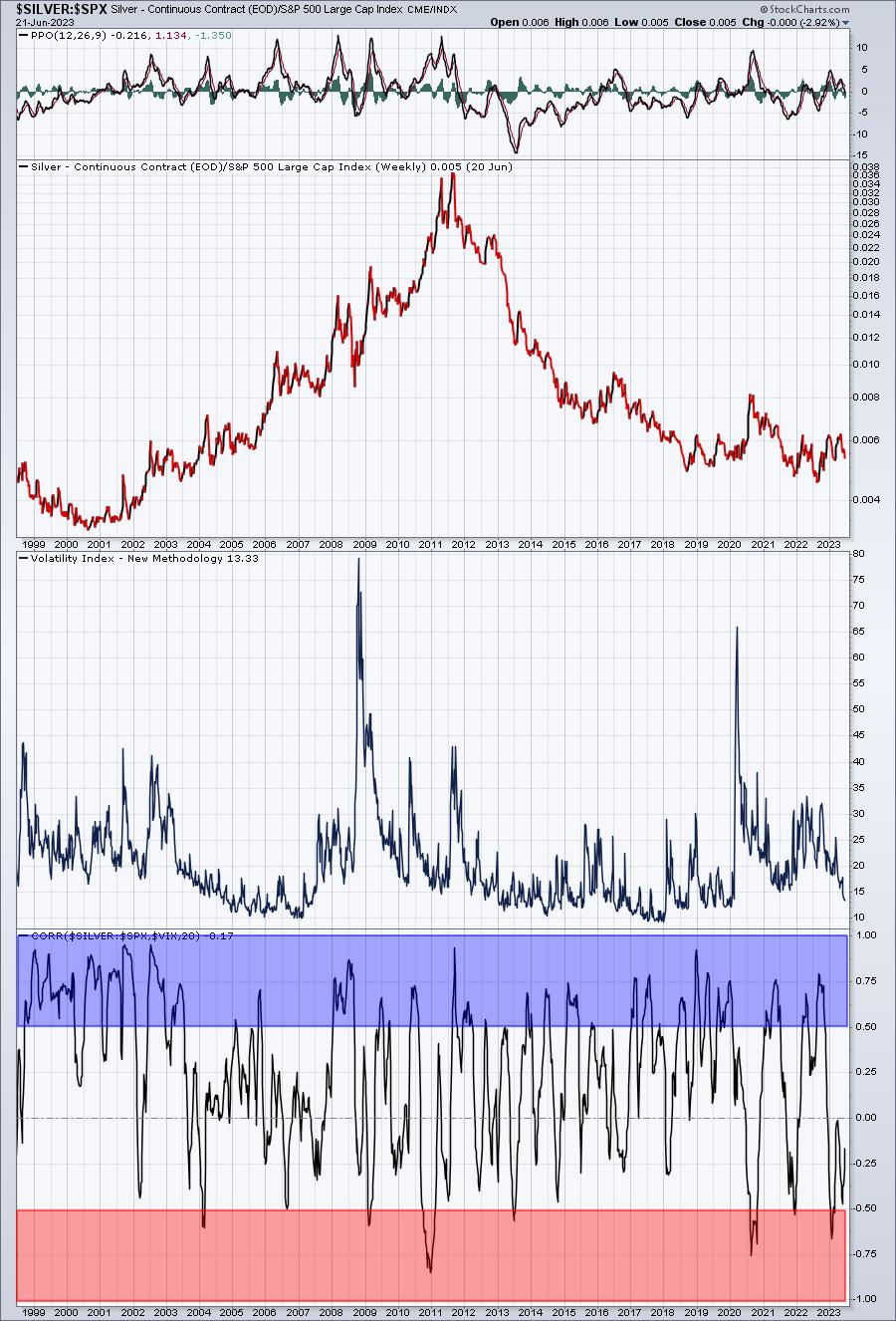
Notice that silver's relative performance is not nearly as positively-correlated as gold's. Again, it's due to the fact that silver is used in industrial production. So it's demand/price will be more tied to economic strength than gold, though not as much as copper's.
Copper ($COPPER):
This is the metal that I pay closest attention to, because copper is used in many areas of production/construction and is, therefore, heavily tied to global economic strength. If I use the same chart for copper that I used above for both gold and silver, check out the significant difference:
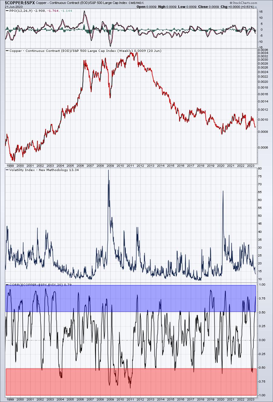
You can see that the correlation between copper's relative strength vs. the S&P 500 and the direction of the VIX isn't quite so correlated. There's definitely a mixture here. It's because if the economy expands, demand for copper goes UP, and that same economic strength takes the S&P 500 UP, and the VIX DOWN.
Let's instead see the correlation between copper and the S&P 500:
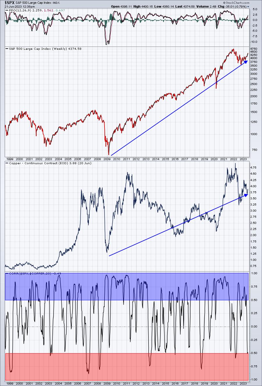
The extreme positive correlation (+.50 and above) is seen much more often on this chart, telling us that copper is much more heavily tied to the economy than it is to fear. This is why my review of copper is a bigger part of my macro view of the stock market and global economies. Note that copper prices bottomed in the middle part of 2022, close to the same time as the S&P 500. This positive correlation again came into play.
Currently, I believe the falling VIX and renewed secular bull market advance in U.S. equities spells trouble for many commodities on a relative basis. They may move higher on an absolute basis, but I believe the S&P 500 is the better investing option for the balance of 2023 and into 2024.
Commodities: Crude Oil ($WTIC)
Crude oil is a solid global economic indicator for the most part, because as global economies strengthen, demand for crude oil rises. So there's another correlation here that I like to follow. Check this out:
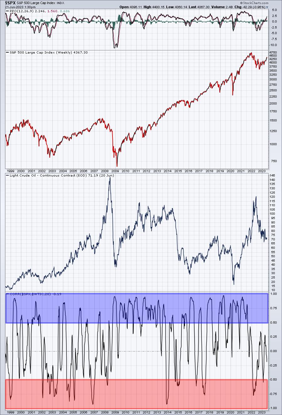
This is by no means a perfect positive correlation. But you can see that we have more positive correlation than inverse correlation based on the blue vs. red shading. There's a geopolitical risk in crude oil, plus demand for crude is not uniform around the globe at all times. There's also the uncertainty surrounding OPEC and their plans for potential production cuts....or increased production. In other words, the price of crude is directly impacted by global demand, but supply can vary substantially based on what oil-producing countries decide to produce. Therefore, we'll never see economic demand entirely reflected in the price of crude and, hence, the uncertain level of positive correlation.
International Markets
There are essentially two things I look at when comparing the S&P 500 to a foreign market. The first is relative strength. Which one is trending higher vs. the other. The second is my view of the dollar, because when you invest in an ETF that tracks a foreign market, your return will either be bolstered or diminished, depending on the weakness or strength of the U.S. dollar ($USD), respectively.
I like to use Germany as an example, because the correlation between the U.S. and Germany in both our equity and bond markets is quite strong. But you can do this same exercise with other foreign markets.
First, which market is performing better?
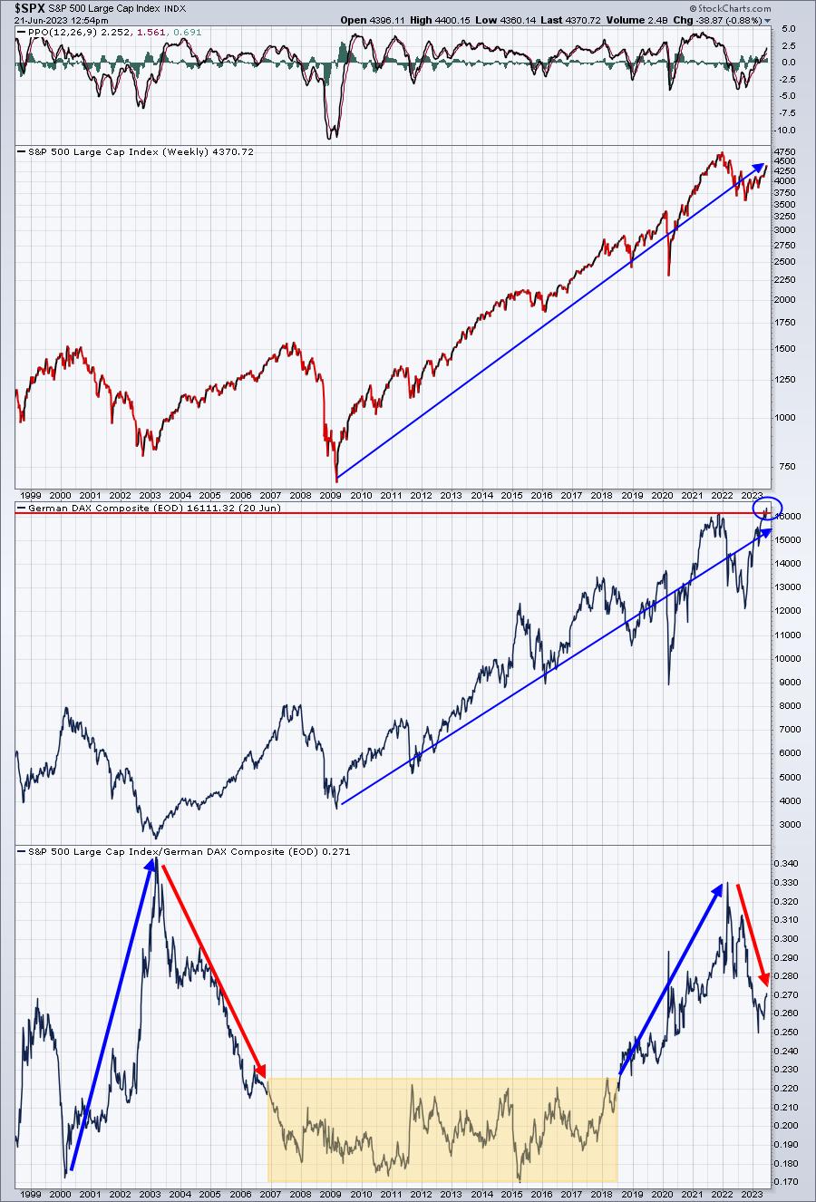
They're both going higher as you can see from the top two panels. But the bottom panel actually pits the two markets against one another. When this relative line is rising, the S&P 500 is outperforming. When it's falling, the German DAX is outperforming. You can see that we go through periods where each outperforms. Currently, I'd say the German DAX is outperforming as it just reached an all-time high. That's another reason why I feel it's only a matter of time before the S&P 500 follows suit. If you want to see the correlation between these two benchmarks, it's rather eye-opening how positively they're correlated:
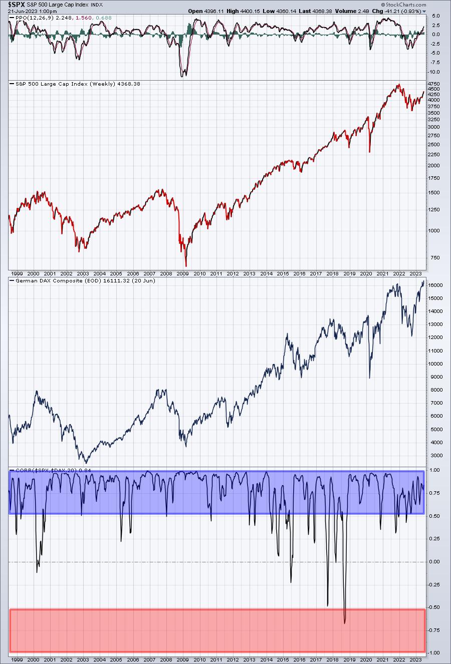
In the last 25 years, this correlation hit -0.50 just ONE time. When one goes up, it's a safe bet that the other will join.
So the next question. If the DAX is outperforming the S&P 500, does that mean the EWG (ETF that tracks the DAX) is a great investment? Well, maybe. It depends on the direction of the dollar. The following chart shows you the EWG vs. DAX ratio, the EWG, the DAX, the U.S. Dollar ($USD), and the correlation between EWG's relative performance vs. the DAX and the USD. It's a very interesting relationship and one you need to be aware of if you invest in foreign ETFs:
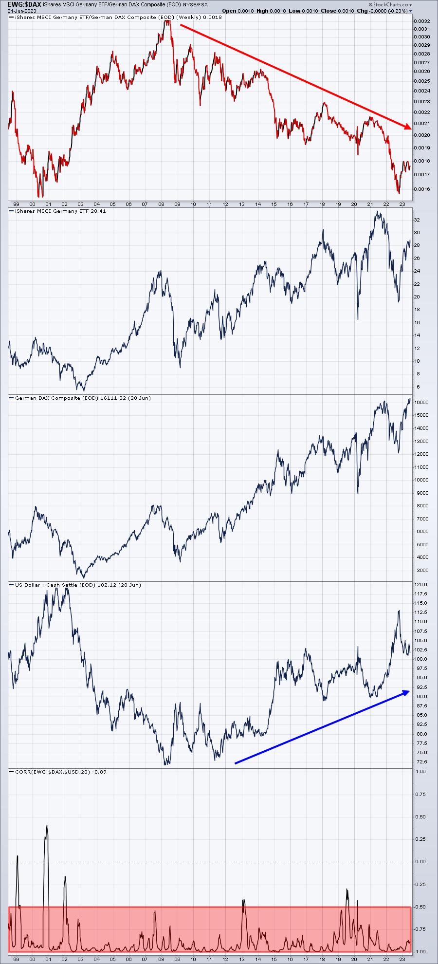
The top panel in this chart shows you quite well that if you invested in the EWG, your EWG performance has lagged the performance of the German DAX by a wide margin over the past 15 years! The reason? Well, check out the dollar strength over these same 15 years. When the dollar is rising, EWG will lag the DAX. But when the opposite is true and the dollar falls, then EWG will outperform the DAX.
Many investors don't understand this relationship, but everyone should, particularly if you invest in ETFs that track foreign markets. We know it's been a stellar year so far for U.S. stocks, especially the NASDAQ 100 (QQQ), but how do foreign ETFs rank against the U.S. this year? Here's a year-to-date performance for the Top 20 (includes QQQ, SPY, and IWM)
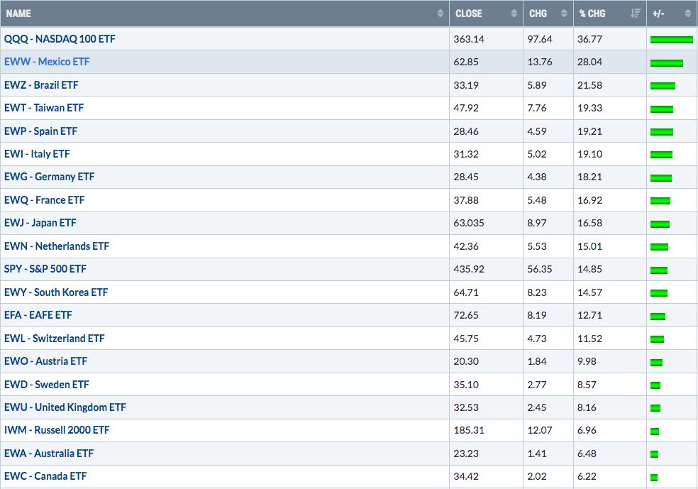
Mexico and Brazil are having excellent years, but a country like Germany just saw its benchmark index ($DAX) break to an all-time high, so it could quickly gain ground and catch up.
I'll be back tomorrow with a look at the U.S.
Happy trading!